Posted on

Coffee and Tea Slimline

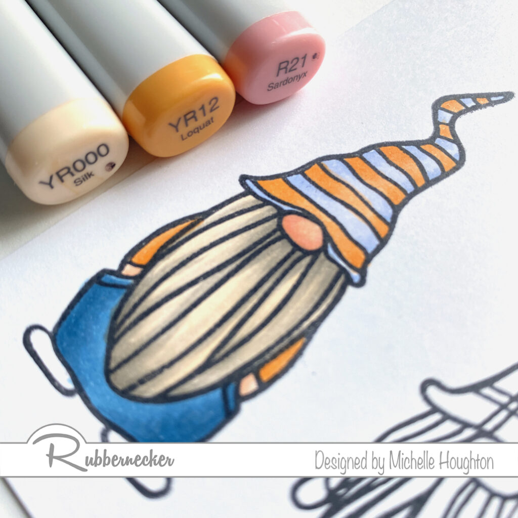
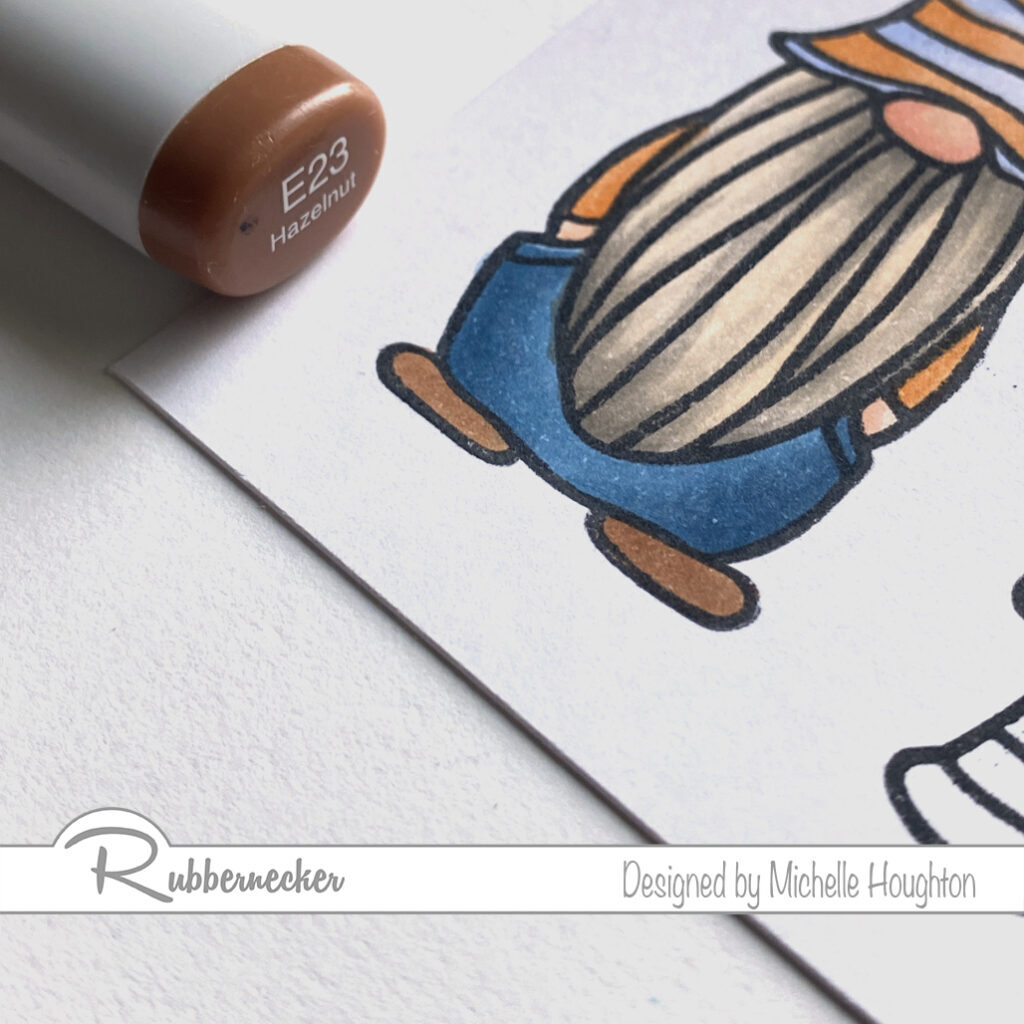
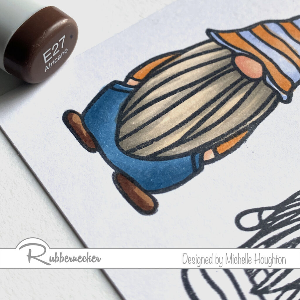
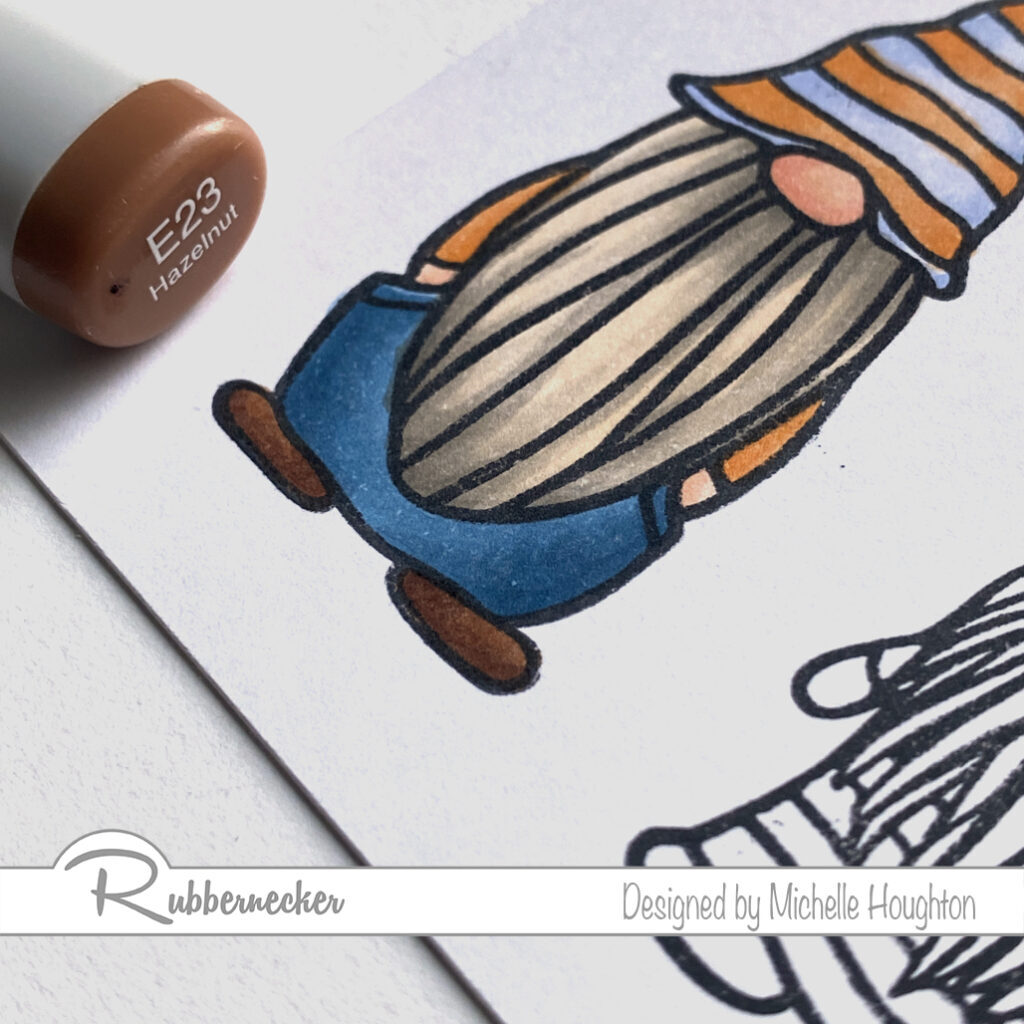
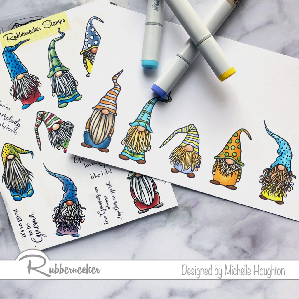
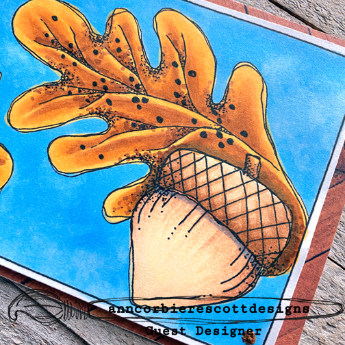
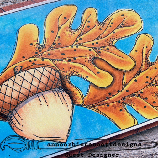
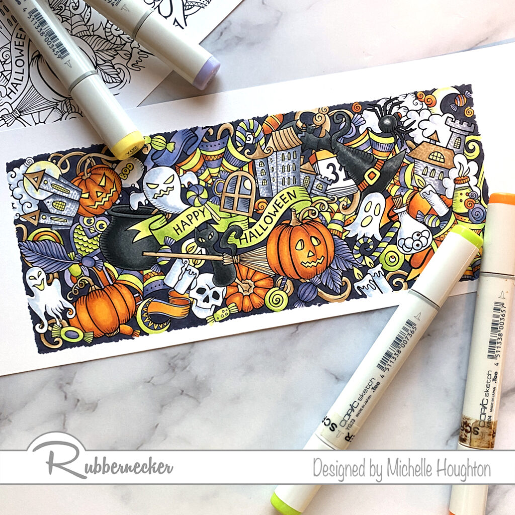
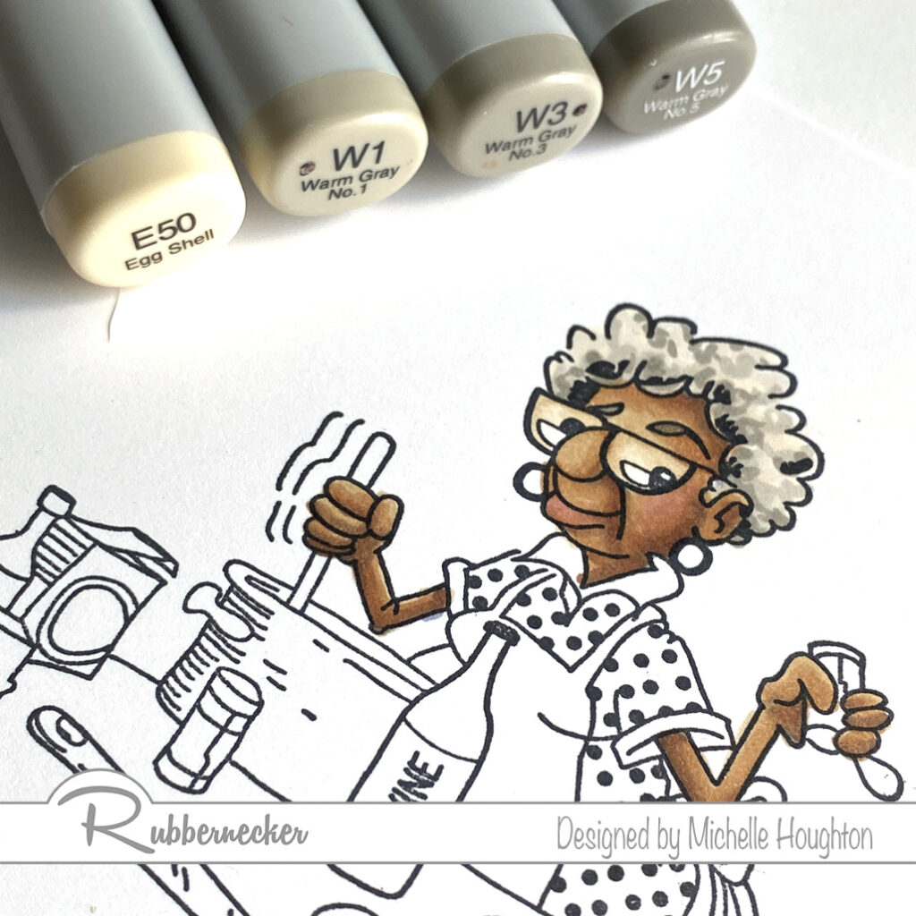
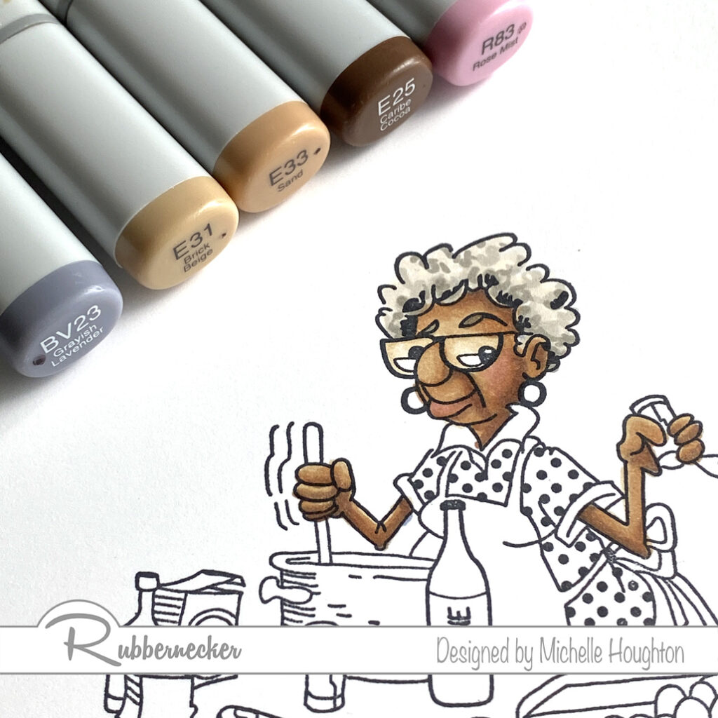
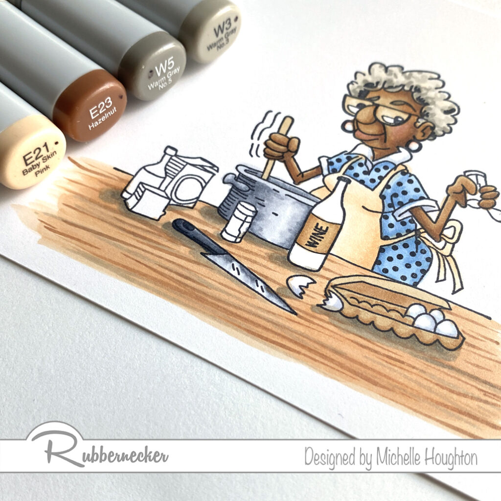
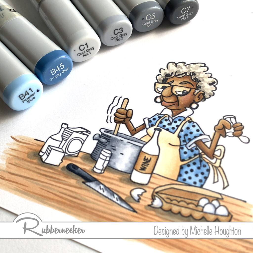
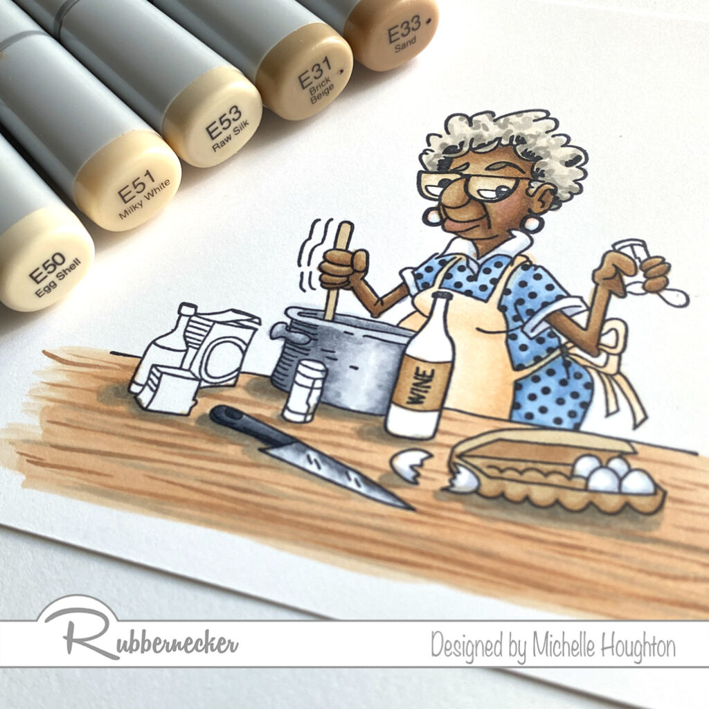
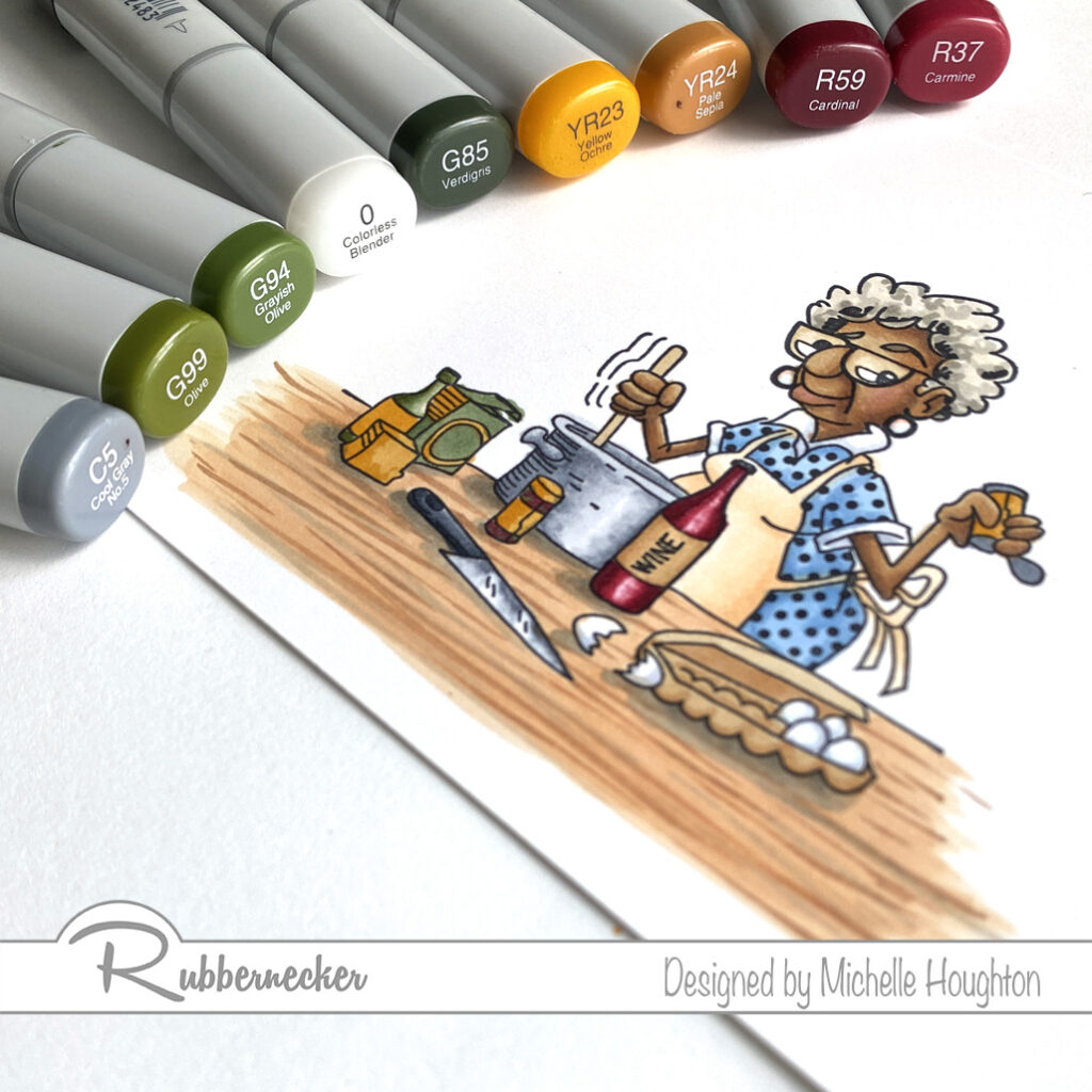
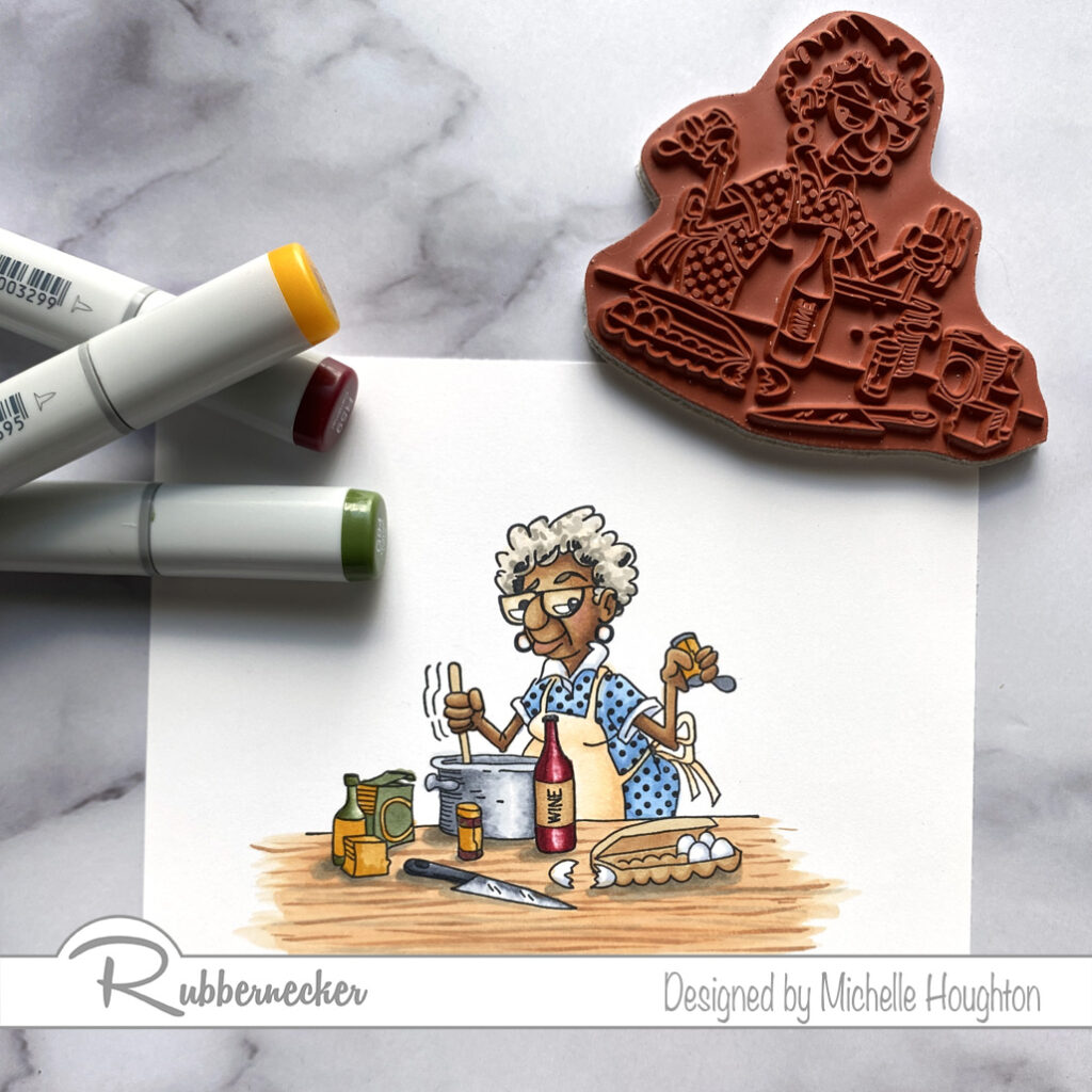
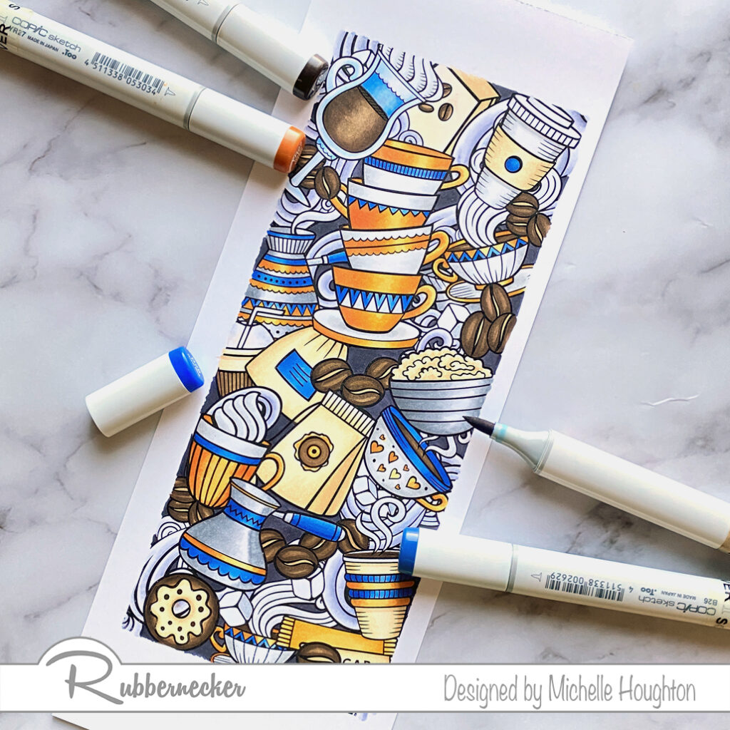
A very quick post today to share two more gorgeous slimline stamps from Rubbernecker. It has truly been a pleasure coloring all of these up for Rubbernecker Stamps. The images and all their detail just scream for coloring. I love both the coffee and tea images. Both have a lot of earth tones and I added a few accent colors to each and I am loving the result on both.

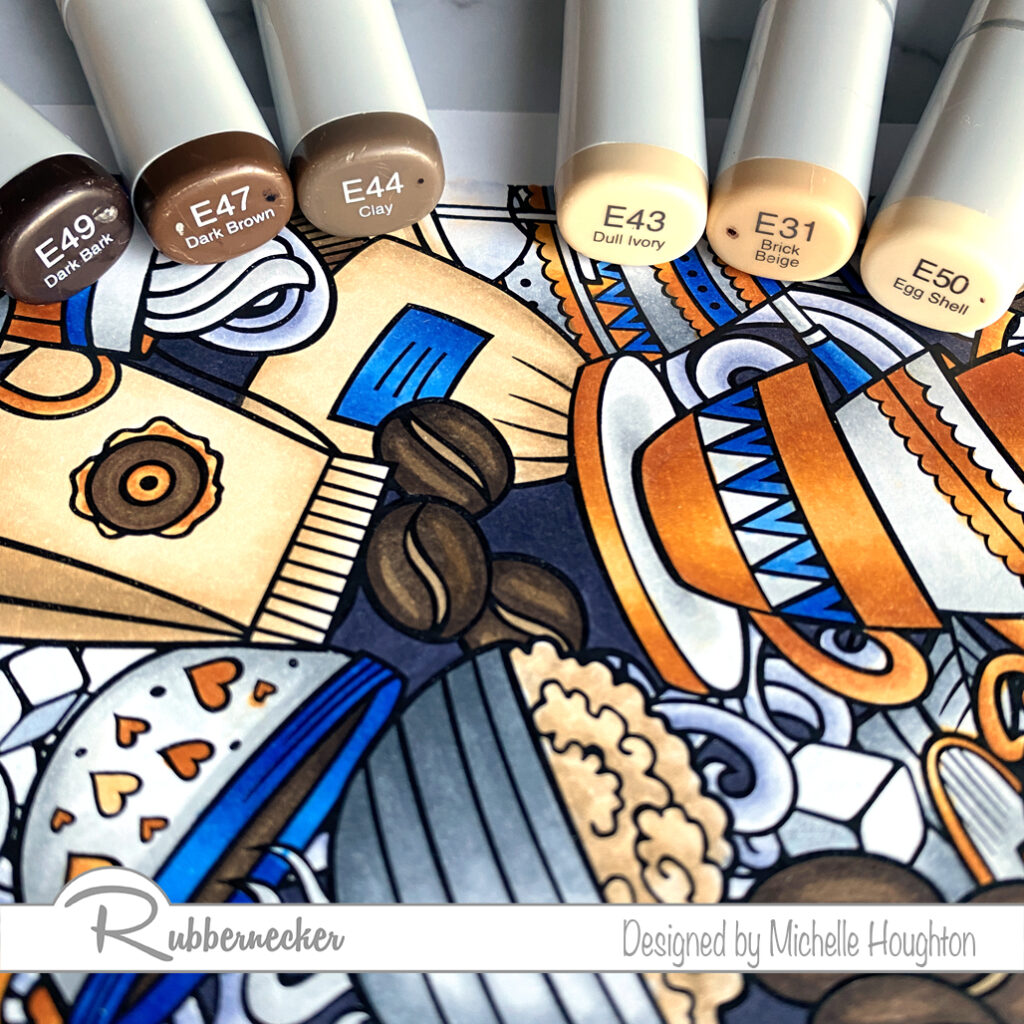
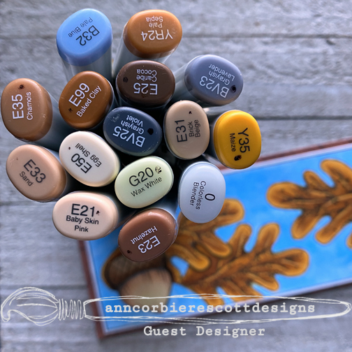
  • For coffee beans, coffee in mugs and other dark brown details use a series of 3 dark earth tones. (E49, E47, E44)
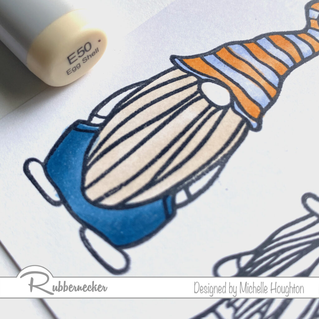
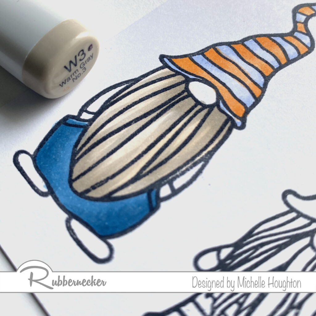
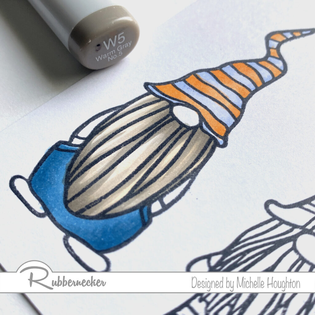
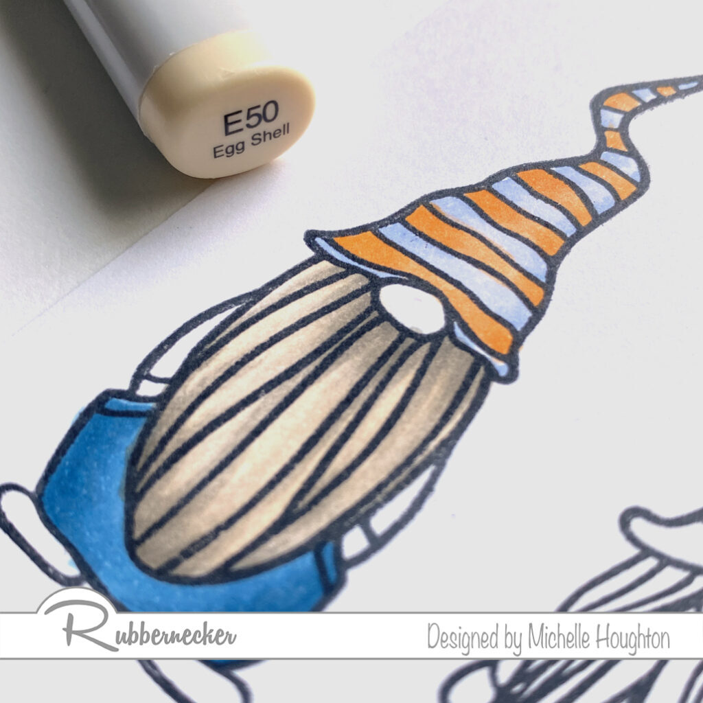
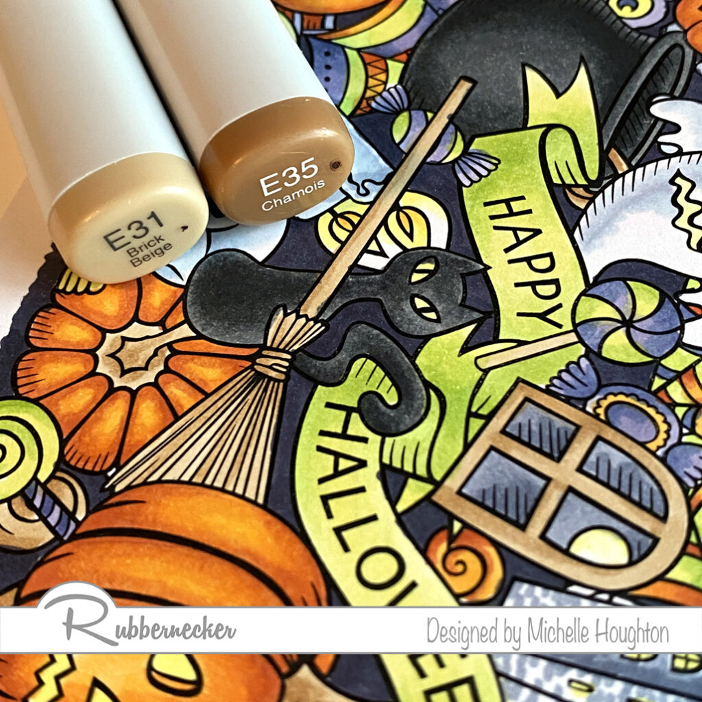
  • For bags, oatmeal and other light brown details find a series of 3 lighter earth tones. (E43, E31, E50)
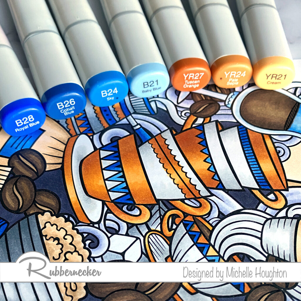
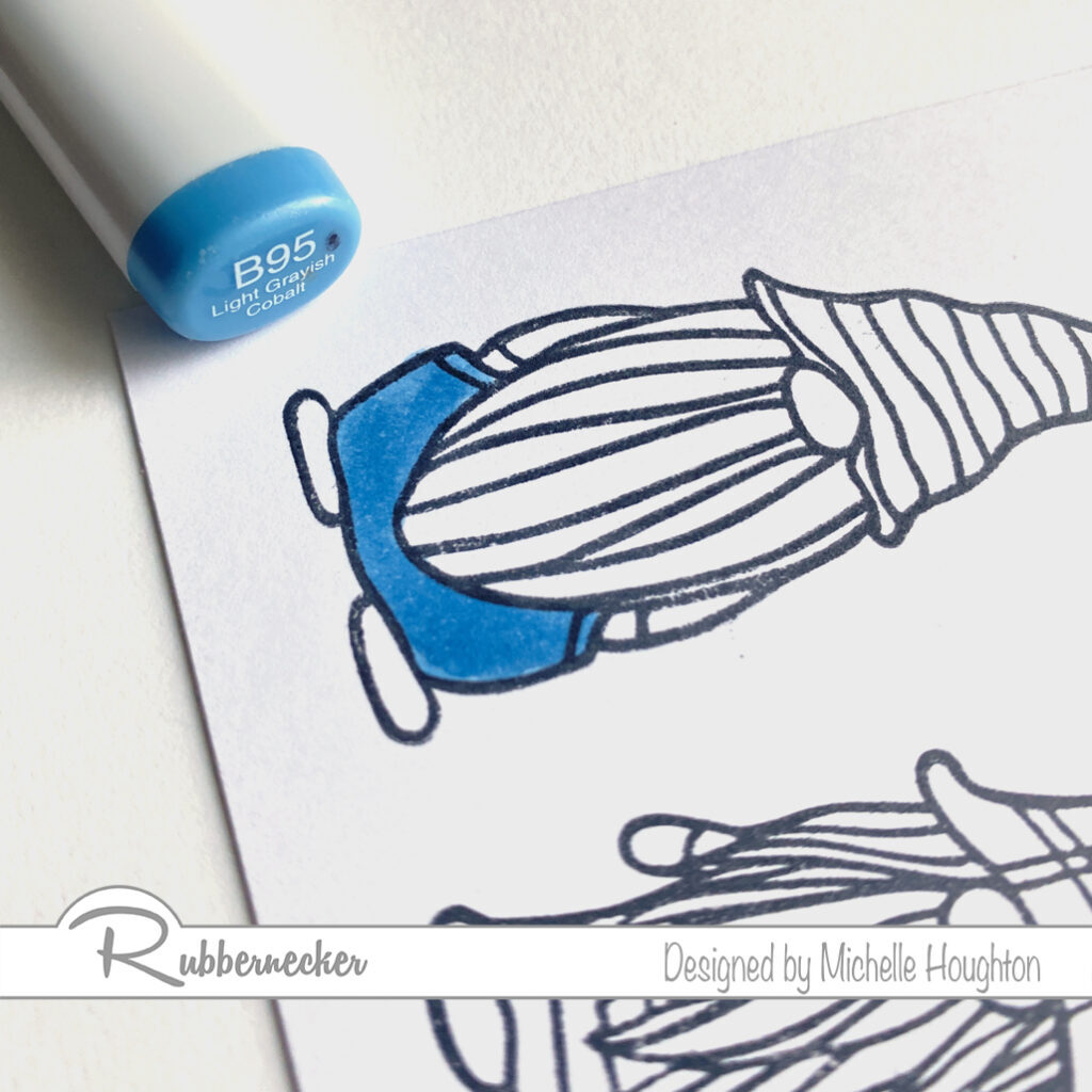
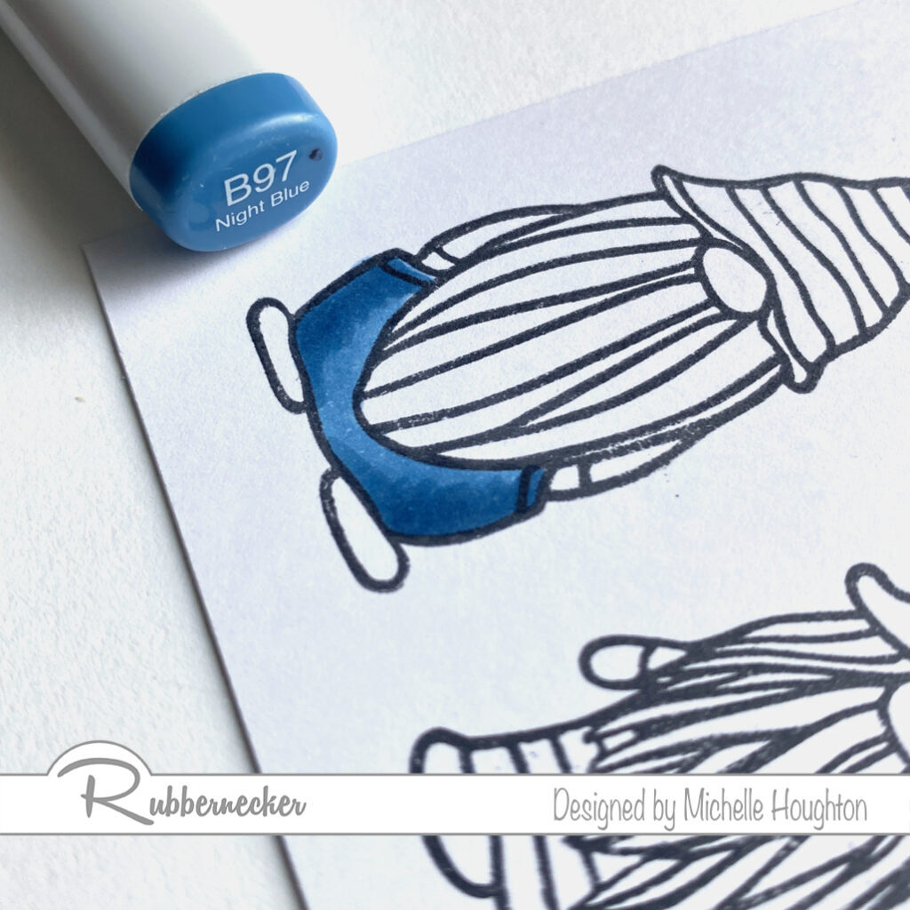
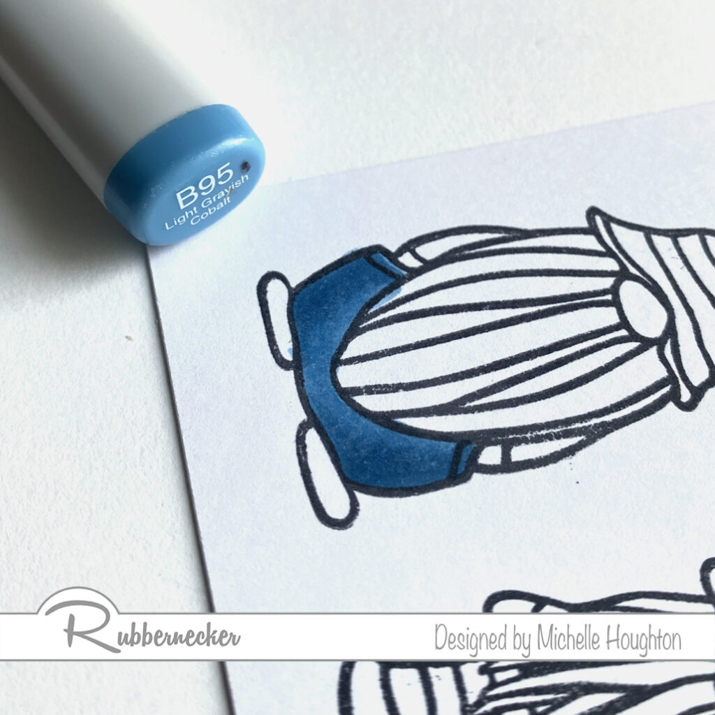
  • For the first of the accent colors use a series of bright saturated blues. (B28, B26, B24, B21)
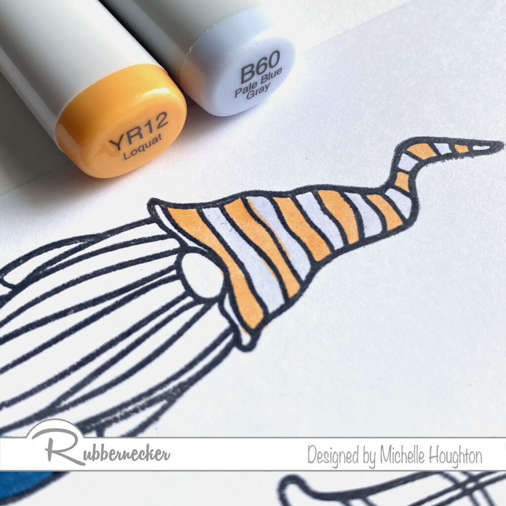
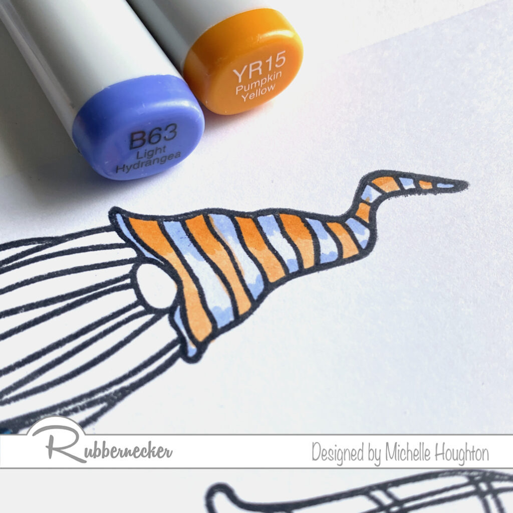
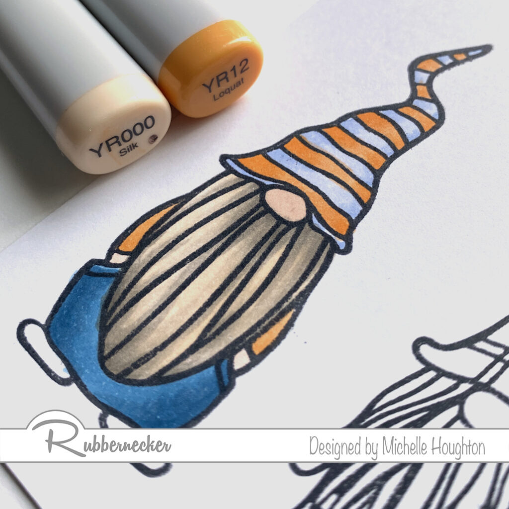
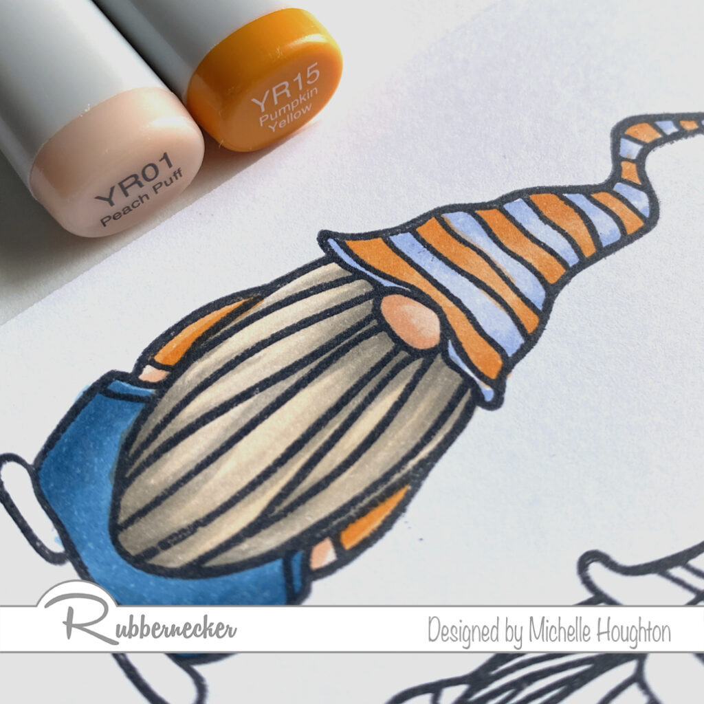
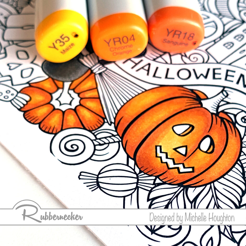
  • To brighten the image with pops of a second accent color find a series of 3 yellow reds. (YR27, YR24, YR21)
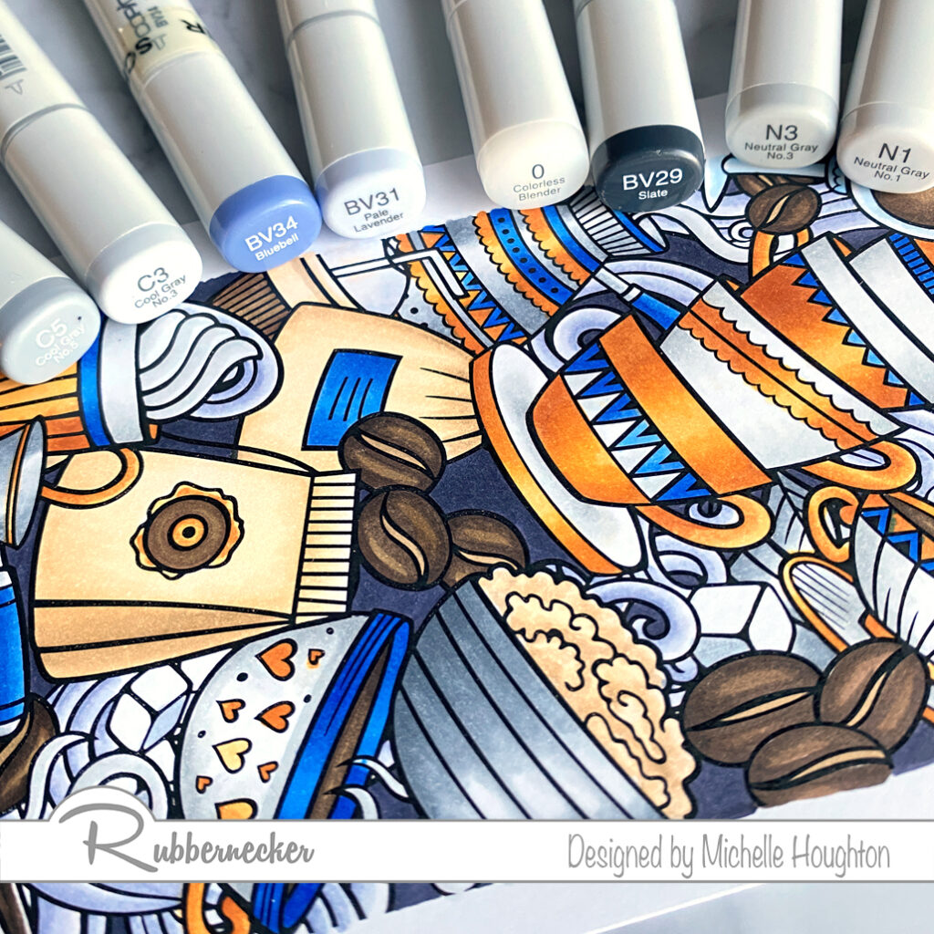
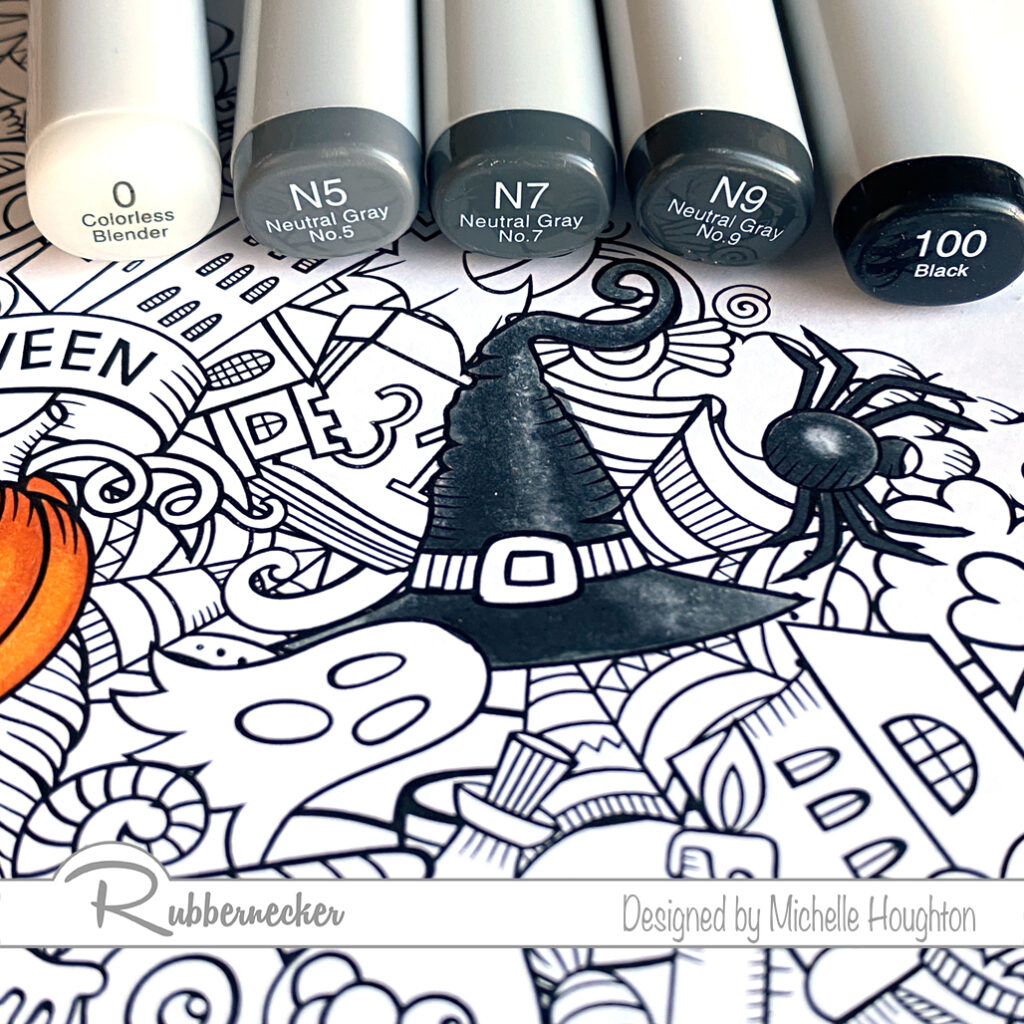
  • For white objects on this image use a series of 2 grays and the Colorless Blender. (N3, N1, 0)
  • On silver areas use two mid-tone grays. (C5, C3, 0)
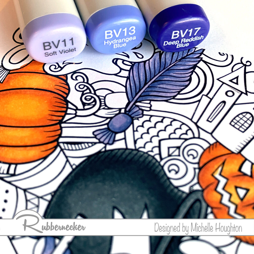
  • Color the steam with two blue violets and the Colorless Blender. (BV34, BV31, 0)
  • Finish the image filling in the background with a darker blue violet. (BV29)
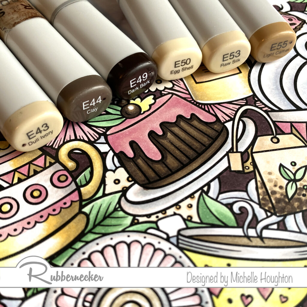
  • For the tea and lighter brown areas use a series of lighter earth tones. (E55, E53, E50)
  • For the deep browns in the image color with 3 darker earth tones. (E49, E44, E43)
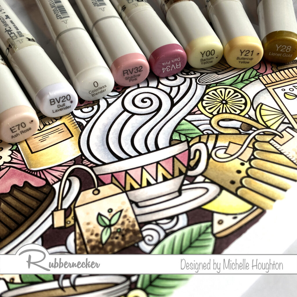
  • For the first accent color on the tea stamp create a gold effect with 3 yellows and the Colorless Blender. (Y28, Y21, Y00, 0)
  • Use 2 red violets for a pop of color on the image. (Rv34, RV32)
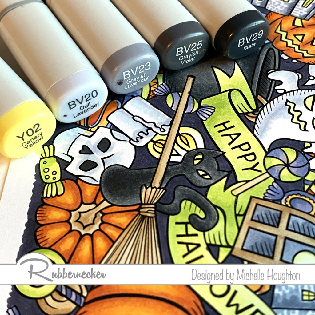
  • Color the white areas with a blue violet an earth tone and Colorless Blender. (BV20, E70, 0)
  • Use a light blue violet to color the steam. (BV20, 0)
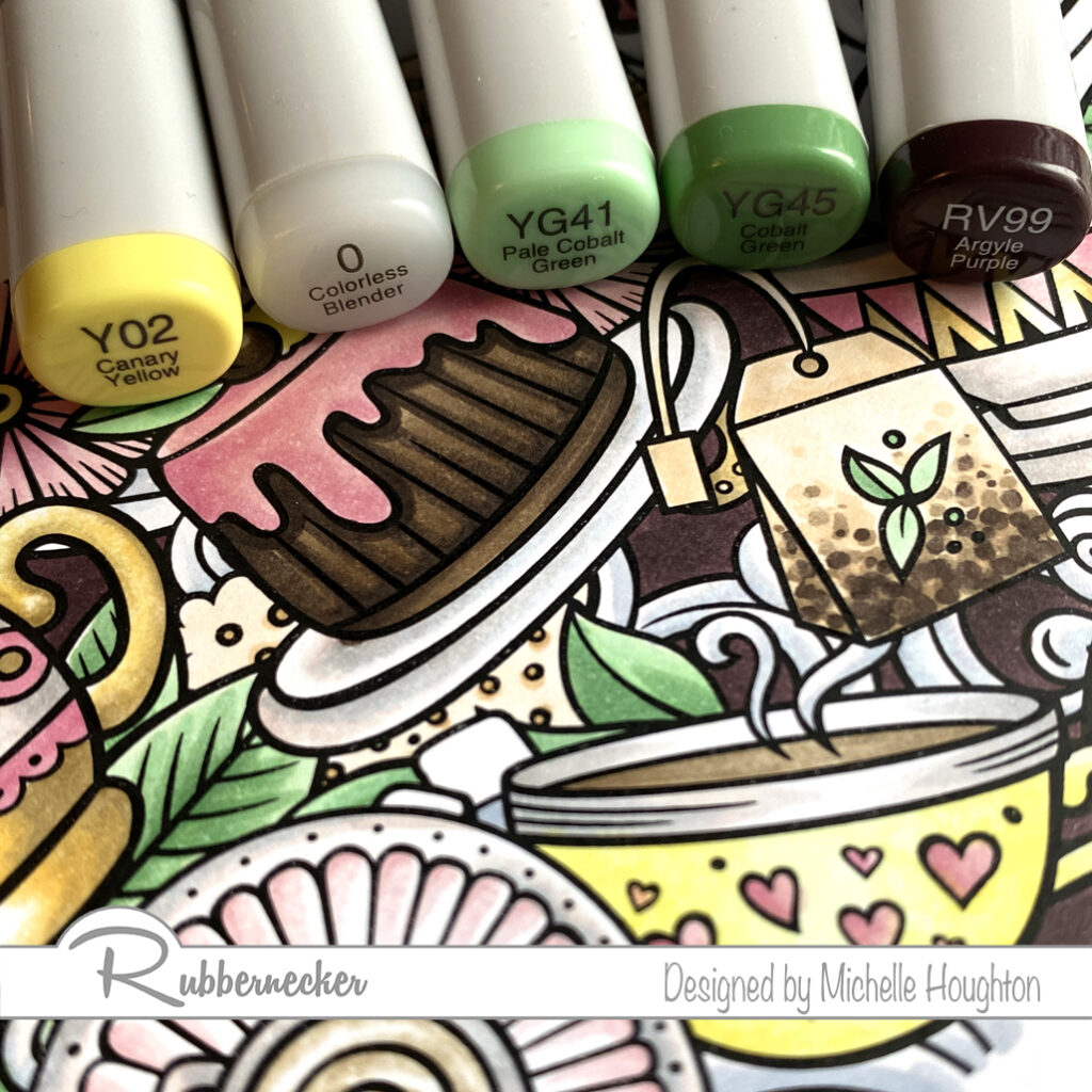
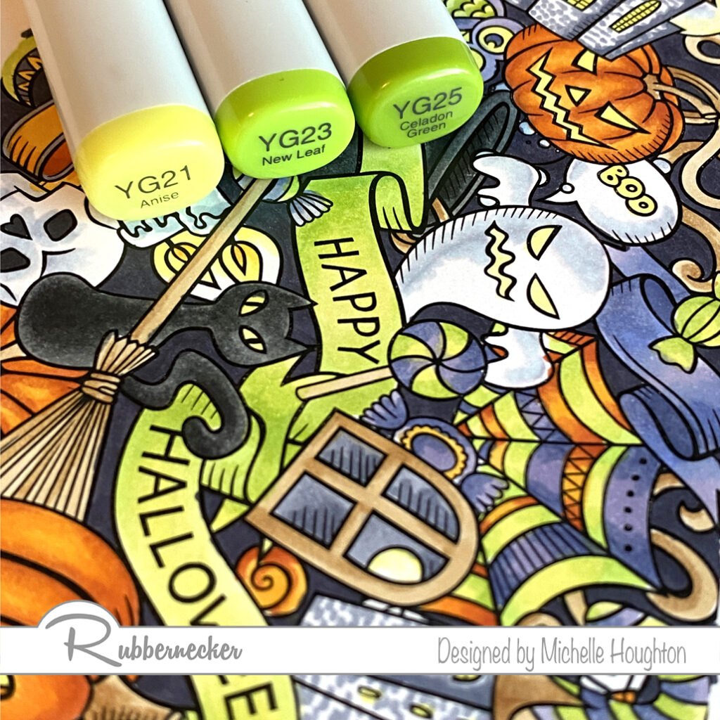
  • For the leaves throughout the image use two yellow greens. (YG445, YG41)
  • Color a few small details left with a light yellow and Colorless Blender. (Y02, 0)
  • Finish the image with a dark red violet to push the background to the back. (RV99)

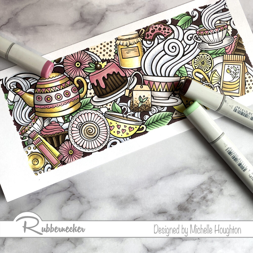
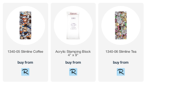
Both images were truly a pleasure to color! There are so many ways to use the slimline stamp collection from Rubbernecker Stamps and if you have time coloring all the little details is well worth it. Thank you for stopping by, links to the Rubbernecker products used can bee found below.

Have a Happy Colorful Day!


Posted on

Gnome Lineup from Rubbernecker

I have an adorable lineup of gnomes from Rubbernecker all in a row that will fit on a slimline card when I have the time to put them on one. For today here is a more detailed break down of how I used my Copic Markers to color one and then the Copic colors I used on the rest of them! I am trying something new with my images since there are SO MANY! You will see mini slideshows below so you will need to scroll through to see the steps! ( Slide shows did not post so sorry this is going to be LONG!

  • Base the pants with a B95
  • Use a B97 to add form bringing the darker coloring from the sides.
  • Blend the colors together using the lighter B95 to smooth out the edges of the B97.
  • Base the stripes of the hat in two light colors, I used YR12 and B60.
  • Use two darker markers to add shape to all the stripes bringing the colors in from the sides again. I used YR15 and B63.
  • Blend the colors together using the lighter markers.
  • Base the beard in a light earth tone. I used E50.
  • Use a warm gray to start creating texture on the beard. W3 is the color I started with.
  • Use a darker warm gray, I used W5 in lesser amounts, to deepen the texture on the beard.
  • Soften the flicks on the beard using the lightest earth tone, E50 in this case.
  • Two small areas to tackle next. Base the skin in a light yellow red, YR000. Then fill the shirt in with a darker yellow red, YR12.
  • Add shape to all these areas with a YR01 on the skin, and the shirt with a YR15.
  • Finish the skin by blending with the lighter YR000 and adding touches of E93. Finish the shirt by blending the colors together with the lighter YR12.
  • Finishing up this gnome with his shoes, base them in an earth tone, E23.
  • Use a darker earth tone along the bottom edge to round them, E27.
  • Blend the colors together using the lighter earth tone, E23.

Here is gnome #1 with all of his colors. In the next slide show I used similar colors for some sections of each of the gnomes so your will see the skin and shoe combos on each of the gnomes!

  • On gnome #2 use the same skin and shoe combination.
  • On gnome #2 use YR31, Y23 and Y26 on the beard.
  • On gnome #3 use the same skin and shoe combination.
  • On gnome #3 use YR31, Y23 and Y26 on the beard.
  • On gnome #4 use the same skin and shoe combination.
  • On gnome #4 use E50, W3 and W5 on the beard.
  • On gnome #5 use the same skin and shoe combination.
  • On gnome #5 use E31, E33 and E99 on the beard.

Now let’s look at the clothing on each of the gnomes.

  • Gnome #2 uses a set of blues and yellow greens, B00, B02, YG13 and YG17.
  • Gnome #3 uses yellow greens and yellows, YG13, YG17, Y35 and Y38.
  • Gnome #4 uses yellows and blues, Y02, Y06, B60 and B63.
  • Gnome #5 uses yellows and a different set of blues, Y02, Y06, B00 and B02.

I need to complete the scene and get them on a card. They are just too cute and even thought this post is long with all the steps they actually color up extremely quickly! Below you will find links to the Rubbernecker Stamps products in this post. Thank you as always for stopping by!

Have a Happy Colorful Day!


Posted on

Copic Coloring Video With Ann Corbiere-Scott

Hello my friends! This past Sunday I shared that I am Guest Designing for Ann Corbiere-Scott Designs this month. Today I am sharing the wonderful Patricia image. I have a Copic coloring tutorial that is going live today over on the Copic In The Craft Room YouTube channel.

These beautiful acorns and leaves are just screaming for fall colors! Here is a list of the colors I used: Acorn G20, E50, E31, E33, E35 – Tops E21, E23, E25 – Leaves Y35, YR24, E99 – Cast Shadows BV23, BV25 – Sky B32, Colorless Blender. Close Ups…

Because Ann has these sized perfectly for card fronts all I did was add a patterned paper that peeks around the edges and a card base beneath the image.

Thank you so much for stopping by today! Make sure to also stop over at the Copic In The Craft Room YouTube channel to check out the new Copic coloring video.

Have A Happy Colorful Day!

Posted on

New Background Stamps

I hope your coloring fingers are ready! Rubbernecker Stamps has come out with 4 beautiful new background stamps for slimline cards and oh what a treat! Colorers hold on to your markers, pencils and brushes. You are in for a real treat! I colored one of the four in my Copics and have the colors I used below. I will actually have a video next week as well but fare warning, this will not be real time. These take a little longer with all their glorious detail.

I tackled one color group at a time and worked my through the full image. I missed spots and went back once I had gone through each of the color groups I chose. So the step outs here will look a little different.

  • Start with a series that will color all the orange portions of your image. Working on one or two sections at a time use the darkest of the series and find the deepest shadow areas. (YR18)
  • Use a midtone yellow red, overlap the darker color and work further into the white area. (YR04)
  • Use a midtone hello to fill the white area that will be the highlight and been into the midtone yellow red. (Y35)
  • Work your way through the image coloring all the orange areas you can find at first pass.
  • Choose a set of dark grays and a black if you have it and use the darkest in the deepest shadows of one or two black objects in the scene. (100)
  • Use a gray to overlap the black or dark gray and pull into the white area. (N9)
  • Use two midtone grays to work into the white area. Overlap from the darker into the lighter area with each color. (N7, N5)
  • Use a Colorless Blender to soften the edge of the lightest gray or lighten the highlight depending on the object. (Colorless Blender 0) * If an object is shiny leave a bright white highlight, if it is dull leave less contrast.
  • Work your way through the image coloring all the black areas you can find at first pass.
  • Violets or blue violets are next start with your darkest and find the deepest shadows of one or two objects that will be violet. (BV17)
  • Use a midtone blue violet to overlap the darker color and work into the white area. (BV13)
  • Use a light blue violet and fill the white area on the objects blending into the midtone area. (BV11)
  • Work your way through the image coloring all the violet/blue violet areas you can find at first pass.
  • Bright yellow greens are next. Choose a midtone yellow green and work it into the darkest areas on one or two objects in the image. (YG25)
  • Use a lighter yellow green to overlap the darker color and work into the white areas on the objects. (YG23)
  • Use your lightest yellow green to fill the remaining white are and blend it into the midtone area. (YG21) * This would be an opportunity to use a fluorescent Copic if you have one. I think they would work wonderfully here!
  • Work your way through the image coloring all the yellow green areas you can find at first pass.
  • Choose a simple two color combination for areas that could be wood or similar coloring. Use the lighter of the two to fill one or two of the areas. (E31)
  • Use the darker of the two colors to define edges, add texture and depth. (E35)
  • You may or may not need to blend this darker color back in with the lighter of the two. (Ee31)
  • Work your way through the image coloring all the brown areas you can find at first pass.
  • Use small touches of a light yellow to eyes and flames with the midtone yellow used earlier. (Y02, Y35)
  • For white areas use a light blue violet. (BV20)
  • Use the colorless Blender to fade the blue violet into white. (Colorless Blender 0)
  • Use the midtone and darker blue violet in the same series for other objects with light gray and white tones. (BV23, BV25)
  • My favorite objects with these darker blue violets are the buildings or castles. I created a small brick pattern with rows of dots across the buildings.
  • Use the darkest of the blue violets to fill the back spaces in-between the objects on the scene. (BV29)

Here is the finished image. It can go straight onto a slimline card or be used with other slimline elements. You could even choose to break apart the image onto smaller cards. Thank you as always for stopping by!

Have a Happy Colorful Day!

Posted on

Copic Coloring – Ethel Cooking

Happy Thursday my crafty friends (and family too.) I am coloring up another Rubbernecker image today. As I settle back into another new routine back in Iowa I will have time to do a lot more coloring and will have all sorts of new images in the line up!

For those of you wondering about Copic College please stay tuned, I am working on how to finish off the year and the possibility of a BIG announcement in the next month! So stay tuned!

On to the coloring! This is “Ethel Cooking” she looks a little feisty to me what do you think?

  • Squiggle a light earth tone into the hair (E50)
  • Use two or three warm grays to dot and squiggle texture and shape into the hair, as you get darker using less of each color. (W1, W3, W5)
  • Under paint the deepest shadow areas with a blue violet. (BV23)
  • Use a lighter earth tone to base all of the skin. (E21)
  • Use two more earth tones to add shape to the skin areas. (E23, E25)
  • Blend the skin smooth going in reverse through the earth tones. (E23. E21)
  • Base the counter in a lighter earth tone, my goal was a butcher block look. (E21)
  • Use a darker earth tone and two warm grays to create wood grain and cast shadows under the objects on the counter. (E21, E23, W5, W3)
  • Base Ethel’s dress in a light blue. (E41)
  • Use a darker blue to add shape to her body. (E45)
  • Use cool grays to add form to the pot, knife and eggs. (C1, C3, C5, C7)
  • Use a light earth tone to base Ethel’s apron. (E50)
  • Use small amounts of two more earth tones to keep Ethel looking plump. (E51, E53)
  • Two different earth tones give the look of cardboard to the egg carton and aged paper to the wine label. (E31, E33)
  • Use a group of Yellow reds, reds and greens to finish off the assortment of ingredients at Ethel’s work station. (YR23, YR24, R59, R37, G85, G94, G99, C5 and Colorless Blender)

For those of you that need to see more of the process there will be a full video posted next Wednesday. Below you will find a link to the stamp. Thanks as always for checking in!

Have Happy Colorful Day!