Those of us in the Copic world call Y25 Celadon Green, but over at Pantone they call this hue of yellow green Greenery and it is the 2017 color of the year! If you have not heard of the Pantone color of the year here is the definition that they share:
What is the PANTONE Color of the Year?
A symbolic color selection; a color snapshot of what we see taking place in our global culture that serves as an expression of a mood and an attitude.
If you would like to read more here is a direct link to the website.
https://www.pantone.com/color-of-the-year-2017
They share why the color was selected and why they think not only fashion is moving towards more “greenery” but the culture as well. I particularly loved the lower portion of the article however, where they shared several color combinations featuring “Greenery” with other colors.
My favorites are:
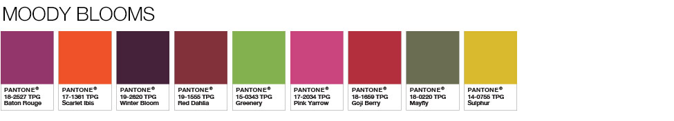
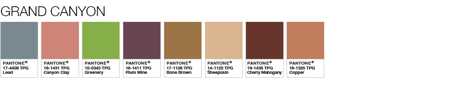
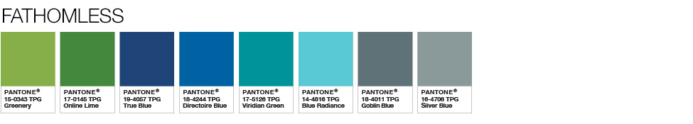
To me these all look like color challenges! And since I got some really fun new stamps from some of the manufactures at Creativation 2017 I figured, “Bring it on!” I am ALWAYS up for a color challenge. I have two stamps picked out, one for the Moody Blooms and the other for the Grand Canyon series above, I will have to come back to the Fathomless 🙂
My Colors for the Moody Blooms series are; RV69, R08, BV29, R39, YG25, RV19, R59, G85, Y26. I added YG21 and YG67 to add more depth to the leaves, B000 for some sky, and BV23 into the ground shadows.
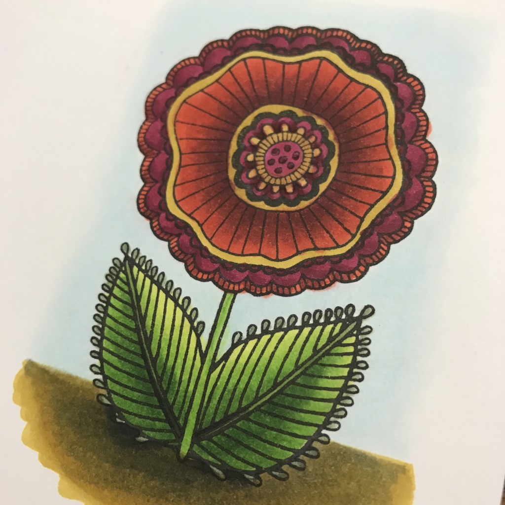
I got this fun stamp from Dare 2B Artzy. They were super sweet and shared some stamps AND a stamp pad that they make that is, YES, compatible with Copics Yipee! Here is their info again so you can go check out their stamps and inks, along with coordinating papers 🙂 Fun! https://www.dare2bartzy.com
The colors I chose to match the Grand Canyon combination are ; BG72, E04, YG25, V99, E55, E21, E47, E15. I added BG10 and YG67
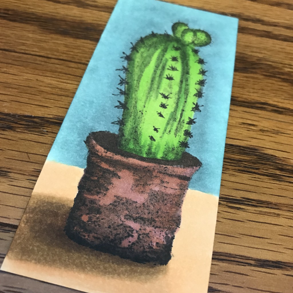
This stamp is part of the new collection from Spellbinders. Keep your eyes out for videos with both these stamp lines! The line from Spellbinders is screaming for my watercolor/Copic Misti technique! Find Spellbinder’s new line up at there site HERE
Looking at the two images side by side it always amazes me how much colors change when you put different colors around them! The YG25 looks very different with the jewel tones of the Moody Blooms then the muted tones of the Grand Canyon color scheme. What a fun personal challenge though to start of the 2017 coloring season.
Take a few minutes and do some coloring just for you! Pick a YG25 series from above or a different one from the Pantone site and have yourself a little color challenge! I would LOVE to see what you come up with.
Have a Happy Colorful Day!


Love your beautifully colored D2BA flower!!!
Love the way you colored the Dare 2B Artzy flower. You gave it so much dimension!